Neutral and Off-White Paint Shades are worth considering carefully, so it is best to keep those swatches for at least a full day before making a decision.
It isn’t as easy as it sounds to find the right neutral hue. The way a color appears can change completely depending on the lighting, the undertones, and even the furniture. I’ve finally figured out what really works after painting a few times, regretting a few things, and testing far too many samples. Now, I’m disseminating this knowledge to spare you from making the same mistakes.
Choosing the right neutral and off-white paint shades can completely transform your space and set the perfect mood for your home.
What You’ll Learn
- What makes warmer neutrals and off-white tones different
- The steps I take to test wall shades before I buy them
- The colors I like best and the rooms they look best in
- How light affects both color and mood
- My thoughts on color reliability and real-user reviews
- Fast answers to common decorating questions
Why “Just White” Isn’t So Easy
I have to laugh when someone says that, because there is no such thing as just white.
Some hues are bright and cool, while others are soft and creamy. In one room, the same paint can look brand-new, but in another, it can turn a bit yellow or gray.
The first “pure” tone I tried looked like mint toothpaste. What did I learn? Always try it out before you paint the whole space.
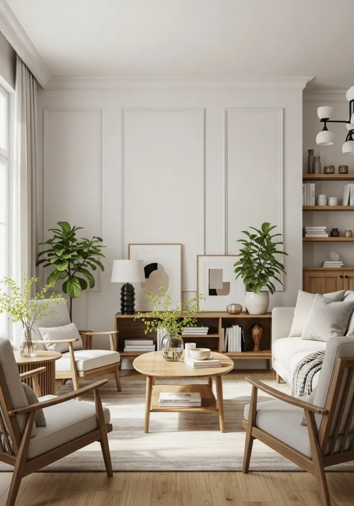
My Favorite Neutral and Off-White Paint Shades
These colors always give a bright, open look without making the room feel sterile, which is precisely what I like.
Sherwin-Williams Pure White: Balanced and crisp; looks excellent in kitchens and living rooms.
Benjamin Moore Chantilly Lace: Sharp and free of undertones—perfect for a gallery-style wall.
Behr Ultra White: Great for trim, ceilings, or adding a little contrast next to warmer shades.
Tip: To keep your trim and walls from looking dull beside new paint, make sure they’re the same light tone.
Warm Neutral Paints I Trust
I call warm tones the peacemakers. They make rooms feel softer and more welcoming by rounding off harsh edges.
Benjamin Moore White Dove: Always flattering—soft, classic, and never yellow.
Sherwin-Williams Alabaster: My pick for bedrooms; calm and even in any light.
Farrow & Ball Wimborne White: A creamy color that pairs beautifully with wood and brass accents.
Warm neutrals add comfort without drifting into beige overload.
Beautiful Off-White Paint Options
I reach for off-white hues when I want a touch of warmth but not a full cream tone. They disguise surface flaws and add quiet depth to a room.
Sherwin-Williams Oyster White: A trace of beige—great for hallways or offices.
Benjamin Moore Swiss Coffee: Soft, timeless, and pairs easily with any palette.
PPG Gypsum: A subtle gray undertone that blends vintage and modern décor.
Off-white feels refined yet calm, like a confident whisper in design.
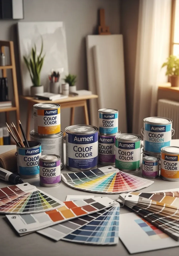
How I Check Paint Samples
Here’s how to make sure you don’t regret your choice later:
- Paint large sample areas on two different walls.
- Examine them morning, night, and under lamplight.
- Hold fabrics and furniture nearby to see how they mix.
- Please consider keeping those swatches for at least a full day before making a decision.
That bit of patience has saved me countless hours—and my back—from repainting.
Light Makes a Big Difference
Paint reflects whatever shines on it.
- North-facing rooms bring out cooler tones.
- South-facing rooms appear warmer and softer.
If a room feels chilly, use warm LED bulbs. If it feels yellow, try daylight lighting. You’ll be amazed at how a tiny tweak changes everything.
Don’t Forget the Finish
Each finish changes how a color behaves:
-
Flat / Matte:
Perfect for bedrooms; hides wall imperfections.
-
Eggshell:
My favorite—soft glow and easy upkeep.
-
Satin:
Best for kitchens and bathrooms.
-
Semi-gloss:
Adds durability and a gentle shine to trim and doors.
Keeping finishes consistent helps all your spaces feel connected.
Combinations I Love
- Natural wood with pale walls: clean and classic.
- Brass fixtures and warm lighting: instantly elegant.
- Off-white with black trim: bold and current.
And since comfort matters as much as style, check out my side sleeper pillow guide—your neck will thank you.
Common Mistakes to Avoid
- Selecting paint under intense fluorescent lights can be challenging.
- Ignoring undertones can lead to unexpected results, such as a subtle green cast.
- Please remember to test colors next to your flooring and furniture.
- Selecting a tone too stark for a warm space can cause it to feel cold.
Best rule: trust how the shade looks on your wall, not the store swatch.
Questions and Answers
Q: How can I keep pale shades from turning yellow?
A: Skip oil-based paints and overly warm bulbs. Latex formulas with LED light keep them bright.
Q: Should ceilings match the walls?
A: I prefer ceilings one shade lighter—it opens the space and adds airiness.
Q: How many coats do I need?
A: Two coats minimum. Light tones need a solid base for even coverage.
Q: What’s the easiest way to spot undertones?
A: Place your sample beside plain printer paper—any hint of beige, gray, or yellow shows immediately.
Q: Can I mix tones throughout my home?
A: Absolutely. Cooler neutrals fit bright rooms; warmer ones suit softer light.
Final Thoughts on Neutral and Off-White Paint Shades
Even though neutrals and warm hues may sound similar, each gives a space its own personality.
A crisp tone energizes. A cozy shade comforts. A soft off-white adds depth without shouting for attention.
Take your time, experiment, and choose what feels right for your home. One thoughtful decision now saves both money and back pain later.


